Enterprise Software

B2B SaaS – Workflow & Automation UX

Rebuilding Email Infrastructure Inside a Legacy Program System
Project Overview

Business →

Retreat Guru’s Program Email Tab was a critical tool for automating guest communication, but its technical setup created significant friction for customers and increased dependency on Customer Support during onboarding.

Retreat Guru’s Program Email Tab was a critical tool for automating guest communication, but its technical setup created significant friction for customers and increased dependency on Customer Support during onboarding.

Challenge →

Users had to work with raw HTML, deal with inconsistent formatting, and navigate confusing scheduling and recipient rules. This made email configuration difficult for non-technical users and led to recurring support questions.

Users had to work with raw HTML, deal with inconsistent formatting, and navigate confusing scheduling and recipient rules. This made email configuration difficult for non-technical users and led to recurring support questions.

Users had to work with raw HTML, deal with inconsistent formatting, and navigate confusing scheduling and recipient rules. This made email configuration difficult for non-technical users and led to recurring support questions.

Solution →

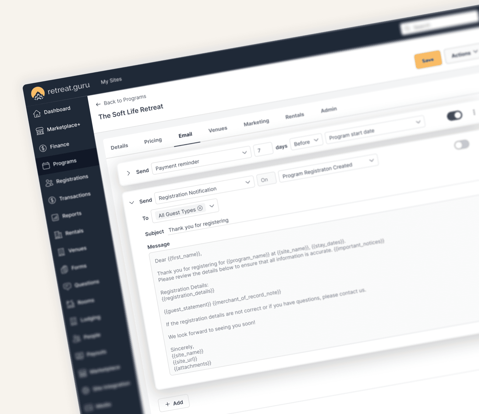
I redesigned the Email Tab around a simpler mental model: When, Who, What, and Active. We replaced HTML editing with structured email and template options, simplified event-based scheduling, clarified recipient selection, and introduced easier email management.

I redesigned the Email Tab around a simpler mental model: When, Who, What, and Active. We replaced HTML editing with structured email and template options, simplified event-based scheduling, clarified recipient selection, and introduced easier email management.

I redesigned the Email Tab around a simpler mental model: When, Who, What, and Active. We replaced HTML editing with structured email and template options, simplified event-based scheduling, clarified recipient selection, and introduced easier email management.

Impact →

The new experience reduced technical complexity and made email configuration more intuitive and predictable. It helped customers set up program emails with less support, improved onboarding, and created a scalable foundation for future email features.

The new experience reduced technical complexity and made email configuration more intuitive and predictable. It helped customers set up program emails with less support, improved onboarding, and created a scalable foundation for future email features.

The new experience reduced technical complexity and made email configuration more intuitive and predictable. It helped customers set up program emails with less support, improved onboarding, and created a scalable foundation for future email features.

My Contributions

I was involved throughout the design process, from research and problem discovery to final UI design and implementation. I reviewed customer feedback and support issues, identified key usability problems, mapped user flows and system behaviors, created wireframes and high-fidelity designs in Figma, explored edge cases, incorporated stakeholder feedback, and collaborated with PMs and developers through implementation and QA.

I was involved throughout the design process, from research and problem discovery to final UI design and implementation. I reviewed customer feedback and support issues, identified key usability problems, mapped user flows and system behaviors, created wireframes and high-fidelity designs in Figma, explored edge cases, incorporated stakeholder feedback, and collaborated with PMs and developers through implementation and QA.

I was involved throughout the design process, from research and problem discovery to final UI design and implementation. I reviewed customer feedback and support issues, identified key usability problems, mapped user flows and system behaviors, created wireframes and high-fidelity designs in Figma, explored edge cases, incorporated stakeholder feedback, and collaborated with PMs and developers through implementation and QA.

The Opportunity

The Program Email Tab was meant to help retreat operators automate communication like confirmations, arrival instructions, and reminders. Instead, it became one of the most confusing and support-heavy parts of the product.

Users weren’t struggling with features they were struggling to understand how the system worked. Most importantly, they didn’t trust it.

As one user said:

“I copied the template exactly, but the email still broke… I don’t understand what I’m doing wrong.”

Another added:

“I’m never sure if ‘before arrival’ means before what exact date.”

And the underlying concern was always the same:

“I don’t want to send the wrong email to the wrong people.”

Research insights

From support tickets and onboarding feedback, the pattern was clear. Users struggled with HTML-based editing, confusing scheduling logic, and uncertainty around recipients. These weren’t isolated issues, they were structural.

The core problem wasn’t missing functionality, but a mismatch between how the system was designed and how users naturally think about communication.

Real Problem

The system forced users to think like this: HTML → rules → timing → recipients. But users were thinking: “Send a confirmation after someone registers.”

That gap between system logic and user intent was the root issue.

Redefining the model

Instead of redesigning UI immediately, I reframed the experience around four simple questions: when is the email sent, who receives it, what is sent, and whether it is active. This became the foundation for the entire redesign.

Solution

Removing HTML complexity

HTML editing was removed completely and replaced with a structured system:

  • Template selection

  • Custom email mode with subject + message fields

This immediately eliminated formatting issues and made output predictable.

Simplifying scheduling

Scheduling was rebuilt around real-world events:

  • Registration → On

  • Arrival → Before / On / After

  • Departure → Before / On / After

The UI dynamically reveals timing inputs only when needed, making logic visible and reducing confusion.

Clarifying recipients

Guest selection was simplified with a smart default: “All Guest Types.” Users only refine selection when necessary using a chip-based interface, reducing decision fatigue and preventing accidental exclusions.

Structuring email management

Emails are automatically grouped and ordered by event and timing, ensuring clarity even as programs scale.

Outcome

The redesigned Email Tab significantly improved usability and reduced reliance on Customer Support. Users could now configure emails independently without needing technical knowledge or assistance. It also improved onboarding clarity and eliminated formatting-related issues caused by HTML.

More importantly, users finally felt confident that the system would behave as expected.

Leaning and closing thoughts

This project reinforced that most UX problems aren’t visual, they’re mental model problems. Once the structure aligned with user intent, the interface naturally became simpler, clearer, and more scalable.


This wasn’t just a redesign of an Email Tab. It was a shift from configuring a system to expressing intent clearly.

Leaning and closing thoughts

This project reinforced that most UX problems aren’t visual, they’re mental model problems. Once the structure aligned with user intent, the interface naturally became simpler, clearer, and more scalable.


This wasn’t just a redesign of an Email Tab. It was a shift from configuring a system to expressing intent clearly.

© 2026 Naurin Momin

© 2026 Naurin Momin