Value-Driven UX: Transforming Retreat Guru’s SaaS Website
The Opportunity
The Rentals list was already an important part of users' daily workflow, so rather than redesigning it based on assumptions, I started by understanding how users actually worked with the list.
Research and Discovery
I conducted 5 semi-structured interviews with frequent Rentals users and reviewed existing usage patterns and feedback.
During interviews, users walked through how they typically managed rentals, what information they looked for, and how they created reports.
A few patterns quickly emerged:
“I use the same filters over and over.”
“I want to see the answers to the questions we ask guests.”
“Sometimes I only need a few specific columns.”
What the research revealed
Repetitive workflows: Users repeatedly recreated the same filtered lists instead of being able to save and reuse them.
Hidden information: Rental inquiry responses existed in the system but couldn't easily be used to filter or analyze Rentals.
Limited control: The list displayed a fixed set of information, making it difficult for users to create a view around their specific workflow.
From Research → Opportunity
Rather than treating these as separate problems, I saw an opportunity to rethink the Rentals list as a flexible workspace where users could control both what they see and how they find it.

Saved Views
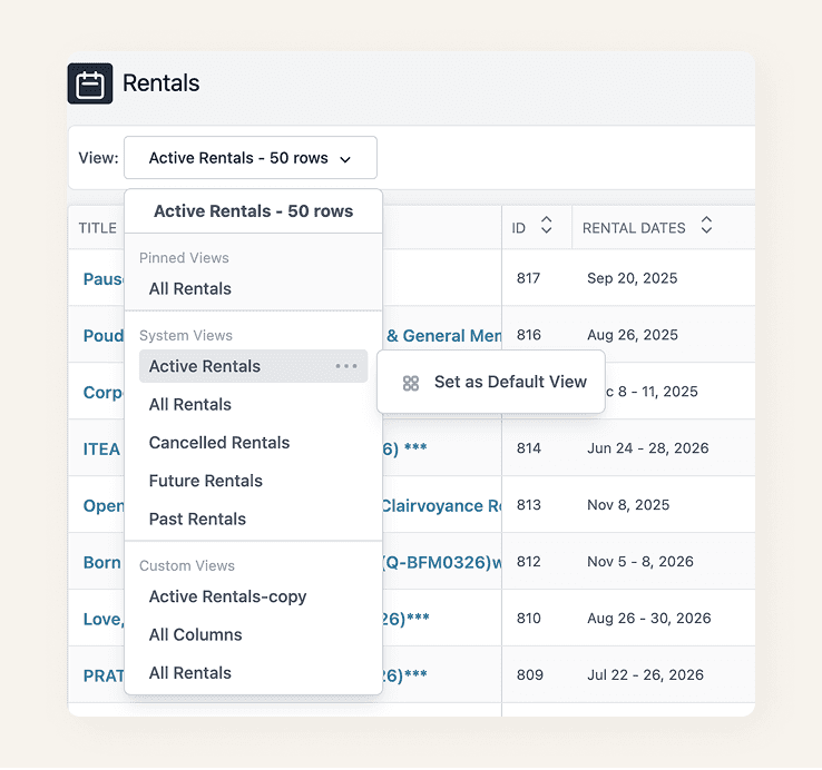
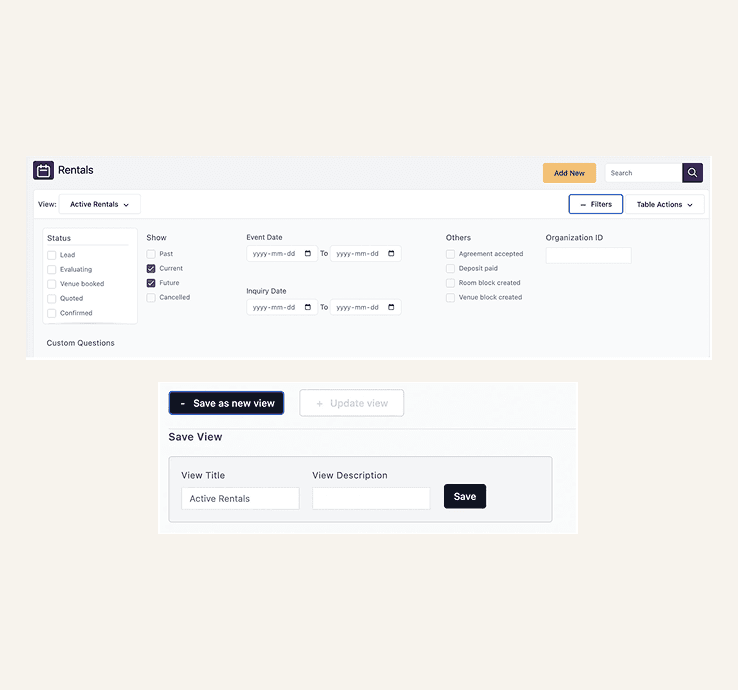
We replaced the previous Saved Reports experience with Views, saved versions of the Rentals list based on a user's filters.
Users can now:
Choose from standard Views
Create custom Views using filters
Save frequently used filter combinations
Pin important Views to keep them at the top
Set a default View for their everyday workflow
Delete Views they no longer need
This made recurring workflows much faster without requiring users to rebuild their filters each time.

A more consistent filtering experience
The entire standard filter experience was redesigned with a clearer structure, hierarchy, and interaction pattern.
The new design:
Makes filters easier to scan and understand
Creates clearer grouping between filter types
Provides a consistent interaction pattern
Establishes a foundation for updating filters across other list pages
Bringing custom questions into rentals
Rental inquiry forms often capture information that is important when reviewing or managing a rental. Previously, those responses couldn't be used to filter the Rentals list.
I helped introduce a new “Display → Rental list” setting for inquiry questions.
When enabled, the question becomes available within the Rentals experience:
Appears under Custom Questions in Filters
Allows users to query rental responses
Can also be added as a visible table column
This connected information collected during the inquiry process directly to the Rentals workflow.


Customizable list columns
The redesigned Rentals list also gives users control over which information they want to see.
Through the + Column Options control, users can:
Add or remove visible columns
Customize the list around their workflow
Include responses from enabled Custom Questions
This means users can focus the list on the information that matters most to them.
Outcome
The redesign transformed the Rentals list from a largely fixed table into a more configurable workflow tool.
• Views made recurring searches reusable.
• Custom Questions made inquiry data actionable.
• Column Options gave users control over what they see.
And the new filtering pattern created a scalable foundation for other list pages across Retreat Guru.
Key Learnings
What started as a request to improve the Rentals list became an opportunity to rethink how users find, organize, and work with data.
Research showed that the challenge wasn’t a lack of features—it was a mismatch between how the system structured information and how users naturally approached their workflows.
What I Learned
Design for the user’s mental model: Understanding how users think about their work is as important as understanding the system.
Give users control without adding complexity: Views, flexible filters, and customizable columns made the experience more adaptable without making it harder to use.
Turn insights into scalable patterns: The redesigned filter experience created a foundation that could be reused across other list pages.
Small workflow improvements can have a big impact: Giving users better ways to find, organize, and act on information can significantly improve everyday product experiences.
Ultimately, designing around how people think and work—not just how the system works—helped create a more intuitive, flexible, and scalable experience.