Redefining Rentals Lists: From Static Tables to Customizable Data Views

The Moment It Became Clear
One of our centers told us: “I know the data is in here somewhere… I just can’t get to it quickly.”
Our SaaS platform powers daily operations for retreat and rental centers. Every day, staff manage:
• Rental inquiries
• Transactions
• Rooms
• Programs
• Custom question responses
The data was there. The flexibility was there. But the experience wasn’t. Filters were cluttered. Reports weren’t really reports. Custom question responses weren’t easily queryable. And the UI didn’t reflect the modern design system we were moving toward. This wasn’t a feature problem. It was a mental model problem.
The Core Issue
Users relied heavily on list views to run their business. But:
“Saved Reports” were actually saved filters.
Filters and column settings lived in disconnected areas.
Important actions were buried at the bottom of pages.
Long filter lists were overwhelming.
Custom rental inquiry questions couldn’t be easily reported on.
The experience varied across modules.
For power users, it felt inefficient. For new centers, it felt confusing.
We were redesigning a core workflow — one that people used every single day.
The Shift in Thinking
Instead of asking: “How do we redesign filters?”
I reframed the question to: “How do users think about viewing their data?”
The answer wasn’t “reports.” It was Views. Users don’t think in terms of generating reports.
They think in terms of:
“Show me arriving today.”
“Show me unpaid rentals.”
“Show me diversity question responses.”
“Show me only this program.”
That insight changed everything.
The Solution: A Scalable Views System
Always in a View
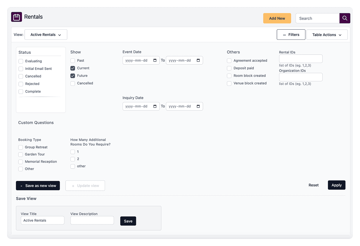
During research with a few active centers, it became clear that users didn’t think in terms of “reports.” They thought in terms of how they wanted to see their data — unpaid rentals, arrivals today, or specific program types. To match that mental model, we created Saved Views. Users are always in a View and can update it or save a new one, giving them control without confusion.
Filters That Make Sense
Instead of overwhelming users with options, we organized filters around their goals. Standard filters and custom questions were clearly grouped, and long lists were made easy to navigate. The interface now feels lighter, letting users focus on finding the data that matters most.
Data That Works for Users
Previously hidden insights, like rental inquiry responses, are now reportable and actionable. Users can explore their data, see what they need at a glance, and make decisions faster. The result is a system that adapts to the way users think, not the way the UI was built.
My Role in This Project
This project was more than a UI refresh — it was a system-level rethink, and I led the end-to-end design effort. On the product side, I reframed “Reports” into a structured Views model, defined interaction states such as active, updated, pinned, and default, and designed the update-button logic to activate only when meaningful changes occurred. Throughout, I balanced the needs of power users with simplicity for new users, ensuring the system remained both flexible and approachable.
From an interaction and system design perspective, I created reusable table patterns aligned with our new UI toolkit, designed a scalable filter architecture, and standardized behaviors across all list modules. I also ensured expand/collapse patterns and other interactive elements did not disrupt workflow, keeping the experience intuitive and consistent.
On the design system front, I built reusable Figma components and variants, aligned the UI with our modern design system, and reduced inconsistencies across modules, creating a foundation that could scale across the platform.
Finally, I collaborated closely with product and engineering teams to define the release strategy — deciding when a single deployment made sense versus using a feature flag — and anticipated the impact of migrating existing saved reports, ensuring a smooth rollout for users.
The Impact
Immediate Improvements
• Cleaner, more modern interface
•. Clearer mental model around “Views”
• Reporting on rental inquiry responses now possible
•. Easier export and bulk actions
•. Increased discoverability of customization
Long-Term Value
•. Created a reusable system for all list-based modules
•. Reduced future UX and engineering complexity
•. Improved onboarding clarity for new centers
•. Future-proofed a core workflow
Key Learnings
This project was more than a visual refresh, it transformed how users interact with critical operational data. By listening to centers, we discovered that the challenge wasn’t a lack of features, but a mismatch between how the system framed data and how users thought about it. Rebuilding around a Views-first approach clarified workflows, reduced confusion, and made data more discoverable and actionable.
The biggest learning was that understanding the user’s mental model is just as important as designing the interface. Designing for how people think rather than how the system works allowed us to create a scalable, reusable solution that improves daily workflows, empowers users to find insights faster, and sets a foundation for consistent experiences across the platform.

