SaaS / Wellness & Retreat Management
List & Reporting Interfaces
Designing a Recurring Grocery Delivery Experience for Instacart
Project Overview
Business →
Instacart is an online grocery delivery platform that helps users shop for and receive groceries conveniently. With users frequently repurchasing everyday essentials, there was an opportunity to make repeat shopping faster and more seamless.
Challenge →
Repeat grocery shopping required users to repeatedly search for, add, and purchase the same essential items, creating unnecessary friction. The opportunity was to make recurring grocery shopping easier while maintaining user control, flexibility, and trust.
Solution →
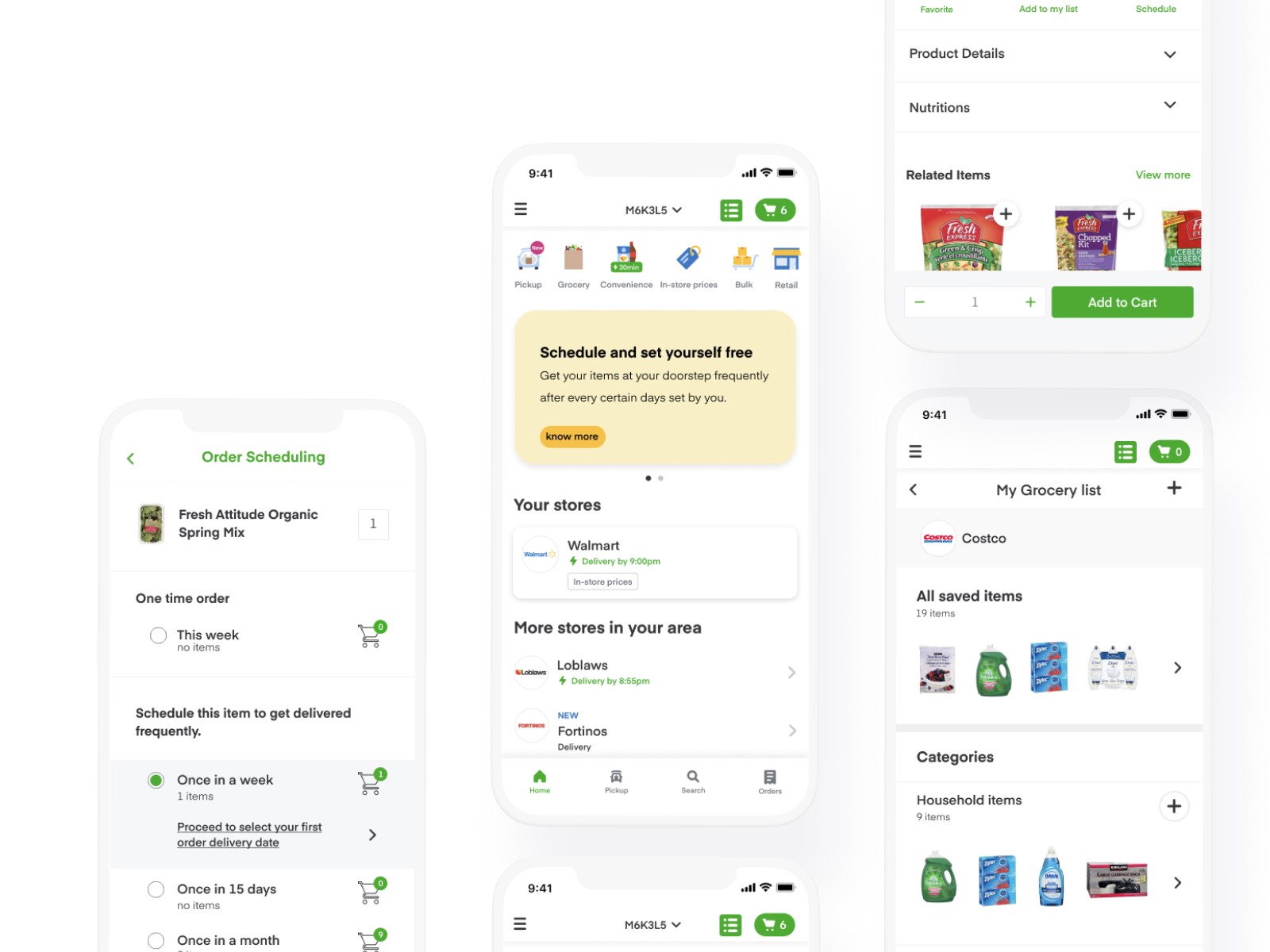
Designed a recurring grocery ordering and reusable grocery list experience that allows users to:
Schedule recurring grocery deliveries
Organize frequently purchased items into categorized lists
Modify or skip upcoming orders
Review and manage orders before they are placed
Handle issues such as out-of-stock items with greater transparency
My Contributions
Led the end-to-end UX/UI design process, from user research and competitive analysis to user flows, wireframes, prototyping, and usability testing. Designed and iterated on the recurring orders and grocery list experience based on user feedback.
Overview
Online grocery shopping has become part of everyday life. What started as a convenience especially during COVID has now turned into a habit. While using Instacart myself, I noticed something frustrating. Every time I needed essentials, I found myself repeating the exact same process searching, adding items, checking out over and over again. It raised a simple question:
Why does something so routine still require so much manual effort?
This wasn’t just a personal inconvenience it pointed to a broader opportunity:
Users regularly buy the same items
The platform doesn’t support long-term planning
Repetition creates friction in an otherwise convenient experience
Framing the Opportunity
Instead of jumping straight into solutions, I wanted to understand:
Is this a common behavior?
Do users actually want automation?
What would make them trust a system to order for them?
This led me to frame the core challenge:
How might we reduce the effort of repeat grocery shopping while giving users control and flexibility?
Understanding the Landscape
I began by looking at competing platforms.
Most grocery apps perform well on:
Speed and delivery
Product variety
Interface usability
But one gap stood out: 👉 Very few platforms offer a truly flexible recurring order experience

Some had limited subscription models, but they lacked:
Customization
Control over scheduling
Transparency in how orders are handled
This reinforced the idea that automation could be a strong differentiator if done right.
Listening to Users
To validate this direction, I conducted 1:1 interviews with five frequent grocery app users.
Instead of pitching an idea, I focused on understanding their real habits:
How they plan groceries
What frustrates them about reordering
Whether they trust automation for essentials
Most users reacted positively to the idea of recurring orders, but their responses quickly revealed tension points.
“What if I want to change something last minute?”
“Will I be locked into a schedule?”
“What happens if something is out of stock?”
This was a turning point.
It became clear that users didn’t just want automation they wanted automation with flexibility and control.
Turning insights into direction
From the research, I synthesized key design requirements that would guide the experience:
Instead of listing them as features, I translated them into experience principles:
Users must always be able to modify or skip scheduled orders
The system must handle uncertainty like stock availability gracefully
Users should receive clear visibility before any order is placed
Alongside this, another opportunity emerged:
users were already mentally grouping groceries in their heads but the app wasn’t supporting that behavior.
This led to the idea of introducing a personal grocery list system with categories, making repeat ordering more intentional and organized.
Bringing the user to life
To better understand who I was designing for, I created a persona based on research insights.
This helped me anchor decisions around a real behaviour pattern rather than abstract users.
Meet Haylie, a busy working professional who relies on grocery delivery weekly. She values convenience but dislikes losing control over her orders.

Mapping the experience
With Haylie in mind, I mapped her end-to-end journey from realizing she needs groceries to completing her order.
This step helped me identify emotional highs and friction points across the flow.

What stood out was a clear pattern:
Planning groceries was scattered
Reordering required memory
There was no “system” supporting repetition
This reinforced the need for structure, not just a feature.
Defining the product direction
To align both user needs and business goals, I mapped them together using a Venn diagram.
This helped clarify that both sides were actually aligned on one key objective:
👉 Reduce friction in repeat purchases to increase retention and engagement

This became the foundation of the solution direction.
Structuring the experience
Before designing screens, I stepped back and looked at the existing Instacart structure.
Since this was not a redesign, but an addition, I focused on integration.
I created an updated site map to identify where new functionality would naturally live within the existing experience.

From there, I defined user flows for key actions:
Creating a grocery list
Scheduling recurring orders
Managing changes before checkout

These flows helped remove ambiguity before moving into design.
From structure to design
With clarity in place, I moved into wireframing.
This was one of the most critical stages because the challenge wasn’t just designing screens, it was ensuring the new experience felt like a natural extension of Instacart.
I explored multiple iterations for:
Scheduling experience
Grocery list creation and categorization
Cart and checkout integration

The focus here was hierarchy and flow clarity, not visuals
Bringing it to life
Using Instacart’s existing design system, I translated wireframes into high-fidelity designs.
The goal was consistency:
No disruption to familiar patterns
Clear visual cues for new interactions
Seamless integration with existing UI

At this stage, the feature started feeling like a natural part of the app rather than an addition.
Testing the experience
I conducted usability testing with 8 participants using Maze and Zoom, focusing on real tasks:
Scheduling a recurring order
Confirming delivery
Creating and using grocery lists
What users experienced
The results showed a strong foundation, but also important gaps.
👍 What worked well:
Users understood the scheduling concept quickly
Flexibility in frequency matched real expectations
Visual design aligned well with Instacart’s system
👎 Where users struggled:
Cart CTA lacked clarity
Some actions were not visually discoverable
Users were unsure what to do after creating categories
Iterating based on feedback
Iterating based on feedback
Based on findings, I refined the experience by focusing on clarity and feedback loops.
Key improvements included:
Making scheduling actions more explicit
Improving visibility of confirmation states
Adding guidance after category creation
Aligning visual cues with existing Instacart patterns

These iterations significantly improved task completion clarity.
Final experience
The final design enables users to:
Schedule recurring grocery deliveries
Organize items into reusable grocery lists
Modify or skip orders without friction
What started as a personal observation evolved into a system designed around real-life repetition, making grocery shopping less about effort, and more about automation with control
Reflection
This project reinforced an important design lesson:
Good automation is not about removing user control, it’s about reducing effort without removing trust.
If I had more time, I would:
Run earlier usability tests before high-fidelity design
Explore personalization based on purchase history
Validate long-term adoption behaviour
SaaS / Wellness & Retreat Management
List & Reporting Interfaces
Designing a Recurring Grocery Delivery Experience for Instacart
Project Overview
Business →
Instacart is an online grocery delivery platform that helps users shop for and receive groceries conveniently. With users frequently repurchasing everyday essentials, there was an opportunity to make repeat shopping faster and more seamless.
Challenge →
Repeat grocery shopping required users to repeatedly search for, add, and purchase the same essential items, creating unnecessary friction. The opportunity was to make recurring grocery shopping easier while maintaining user control, flexibility, and trust.
Solution →
Designed a recurring grocery ordering and reusable grocery list experience that allows users to:
Schedule recurring grocery deliveries
Organize frequently purchased items into categorized lists
Modify or skip upcoming orders
Review and manage orders before they are placed
Handle issues such as out-of-stock items with greater transparency
My Contributions
Led the end-to-end UX/UI design process, from user research and competitive analysis to user flows, wireframes, prototyping, and usability testing. Designed and iterated on the recurring orders and grocery list experience based on user feedback.
Overview
Online grocery shopping has become part of everyday life. What started as a convenience especially during COVID has now turned into a habit. While using Instacart myself, I noticed something frustrating. Every time I needed essentials, I found myself repeating the exact same process searching, adding items, checking out over and over again. It raised a simple question:
Why does something so routine still require so much manual effort?
This wasn’t just a personal inconvenience it pointed to a broader opportunity:
Users regularly buy the same items
The platform doesn’t support long-term planning
Repetition creates friction in an otherwise convenient experience
Framing the Opportunity
Instead of jumping straight into solutions, I wanted to understand:
Is this a common behavior?
Do users actually want automation?
What would make them trust a system to order for them?
This led me to frame the core challenge:
How might we reduce the effort of repeat grocery shopping while giving users control and flexibility?
Understanding the Landscape
I began by looking at competing platforms.
Most grocery apps perform well on:
Speed and delivery
Product variety
Interface usability
But one gap stood out: 👉 Very few platforms offer a truly flexible recurring order experience
Some had limited subscription models, but they lacked:
Customization
Control over scheduling
Transparency in how orders are handled
This reinforced the idea that automation could be a strong differentiator if done right.
Listening to Users
To validate this direction, I conducted 1:1 interviews with five frequent grocery app users.
Instead of pitching an idea, I focused on understanding their real habits:
How they plan groceries
What frustrates them about reordering
Whether they trust automation for essentials
Most users reacted positively to the idea of recurring orders, but their responses quickly revealed tension points.
“What if I want to change something last minute?”
“Will I be locked into a schedule?”
“What happens if something is out of stock?”
This was a turning point.
It became clear that users didn’t just want automation they wanted automation with flexibility and control.
Turning insights into direction
From the research, I synthesized key design requirements that would guide the experience:
Instead of listing them as features, I translated them into experience principles:
Users must always be able to modify or skip scheduled orders
The system must handle uncertainty like stock availability gracefully
Users should receive clear visibility before any order is placed
Alongside this, another opportunity emerged:
users were already mentally grouping groceries in their heads but the app wasn’t supporting that behavior.
This led to the idea of introducing a personal grocery list system with categories, making repeat ordering more intentional and organized.
Bringing the user to life
To better understand who I was designing for, I created a persona based on research insights.
This helped me anchor decisions around a real behaviour pattern rather than abstract users.
Meet Haylie, a busy working professional who relies on grocery delivery weekly. She values convenience but dislikes losing control over her orders.
Mapping the experience
With Haylie in mind, I mapped her end-to-end journey from realizing she needs groceries to completing her order.
This step helped me identify emotional highs and friction points across the flow.
What stood out was a clear pattern:
Planning groceries was scattered
Reordering required memory
There was no “system” supporting repetition
This reinforced the need for structure, not just a feature.
Defining the product direction
To align both user needs and business goals, I mapped them together using a Venn diagram.
This helped clarify that both sides were actually aligned on one key objective:
👉 Reduce friction in repeat purchases to increase retention and engagement
This became the foundation of the solution direction.
Structuring the experience
Before designing screens, I stepped back and looked at the existing Instacart structure.
Since this was not a redesign, but an addition, I focused on integration.
I created an updated site map to identify where new functionality would naturally live within the existing experience.
From there, I defined user flows for key actions:
Creating a grocery list
Scheduling recurring orders
Managing changes before checkout
These flows helped remove ambiguity before moving into design.
From structure to design
With clarity in place, I moved into wireframing.
This was one of the most critical stages because the challenge wasn’t just designing screens, it was ensuring the new experience felt like a natural extension of Instacart.
I explored multiple iterations for:
Scheduling experience
Grocery list creation and categorization
Cart and checkout integration
The focus here was hierarchy and flow clarity, not visuals
Bringing it to life
Using Instacart’s existing design system, I translated wireframes into high-fidelity designs.
The goal was consistency:
No disruption to familiar patterns
Clear visual cues for new interactions
Seamless integration with existing UI
At this stage, the feature started feeling like a natural part of the app rather than an addition.
Testing the experience
I conducted usability testing with 8 participants using Maze and Zoom, focusing on real tasks:
Scheduling a recurring order
Confirming delivery
Creating and using grocery lists
What users experienced
The results showed a strong foundation, but also important gaps.
👍 What worked well:
Users understood the scheduling concept quickly
Flexibility in frequency matched real expectations
Visual design aligned well with Instacart’s system
👎 Where users struggled:
Cart CTA lacked clarity
Some actions were not visually discoverable
Users were unsure what to do after creating categories
Iterating based on feedback
Iterating based on feedback
Based on findings, I refined the experience by focusing on clarity and feedback loops.
Key improvements included:
Making scheduling actions more explicit
Improving visibility of confirmation states
Adding guidance after category creation
Aligning visual cues with existing Instacart patterns
These iterations significantly improved task completion clarity.
Final experience
The final design enables users to:
Schedule recurring grocery deliveries
Organize items into reusable grocery lists
Modify or skip orders without friction
What started as a personal observation evolved into a system designed around real-life repetition, making grocery shopping less about effort, and more about automation with control
Reflection
This project reinforced an important design lesson:
Good automation is not about removing user control, it’s about reducing effort without removing trust.
If I had more time, I would:
Run earlier usability tests before high-fidelity design
Explore personalization based on purchase history
Validate long-term adoption behaviour
E-commerce (Online Grocery)
Subscription & Retention
Designing a Recurring Grocery Delivery Experience for Instacart
Project Overview
Business →
Instacart is an online grocery delivery platform that helps users shop for and receive groceries conveniently. With users frequently repurchasing everyday essentials, there was an opportunity to make repeat shopping faster and more seamless.
Challenge →
Repeat grocery shopping required users to repeatedly search for, add, and purchase the same essential items, creating unnecessary friction. The opportunity was to make recurring grocery shopping easier while maintaining user control, flexibility, and trust.
Solution →
Designed a recurring grocery ordering and reusable grocery list experience that allows users to:
Schedule recurring grocery deliveries
Organize frequently purchased items into categorized lists
Modify or skip upcoming orders
Review and manage orders before they are placed
Handle issues such as out-of-stock items with greater transparency
My Contributions
Led the end-to-end UX/UI design process, from user research and competitive analysis to user flows, wireframes, prototyping, and usability testing. Designed and iterated on the recurring orders and grocery list experience based on user feedback.
Overview
Online grocery shopping has become part of everyday life. What started as a convenience especially during COVID has now turned into a habit. While using Instacart myself, I noticed something frustrating. Every time I needed essentials, I found myself repeating the exact same process searching, adding items, checking out over and over again. It raised a simple question:
Why does something so routine still require so much manual effort?
This wasn’t just a personal inconvenience it pointed to a broader opportunity:
Users regularly buy the same items
The platform doesn’t support long-term planning
Repetition creates friction in an otherwise convenient experience
Framing the Opportunity
Instead of jumping straight into solutions, I wanted to understand:
Is this a common behavior?
Do users actually want automation?
What would make them trust a system to order for them?
This led me to frame the core challenge:
How might we reduce the effort of repeat grocery shopping while giving users control and flexibility?
Understanding the Landscape
I began by looking at competing platforms.
Most grocery apps perform well on:
Speed and delivery
Product variety
Interface usability
But one gap stood out: 👉 Very few platforms offer a truly flexible recurring order experience
Some had limited subscription models, but they lacked:
Customization
Control over scheduling
Transparency in how orders are handled
This reinforced the idea that automation could be a strong differentiator if done right.
Listening to Users
To validate this direction, I conducted 1:1 interviews with five frequent grocery app users.
Instead of pitching an idea, I focused on understanding their real habits:
How they plan groceries
What frustrates them about reordering
Whether they trust automation for essentials
Most users reacted positively to the idea of recurring orders, but their responses quickly revealed tension points.
“What if I want to change something last minute?”
“Will I be locked into a schedule?”
“What happens if something is out of stock?”
This was a turning point.
It became clear that users didn’t just want automation they wanted automation with flexibility and control.
Turning insights into direction
From the research, I synthesized key design requirements that would guide the experience:
Instead of listing them as features, I translated them into experience principles:
Users must always be able to modify or skip scheduled orders
The system must handle uncertainty like stock availability gracefully
Users should receive clear visibility before any order is placed
Alongside this, another opportunity emerged:
users were already mentally grouping groceries in their heads but the app wasn’t supporting that behavior.
This led to the idea of introducing a personal grocery list system with categories, making repeat ordering more intentional and organized.
Bringing the user to life
To better understand who I was designing for, I created a persona based on research insights.
This helped me anchor decisions around a real behaviour pattern rather than abstract users.
Meet Haylie, a busy working professional who relies on grocery delivery weekly. She values convenience but dislikes losing control over her orders.
Mapping the experience
With Haylie in mind, I mapped her end-to-end journey from realizing she needs groceries to completing her order.
This step helped me identify emotional highs and friction points across the flow.
What stood out was a clear pattern:
Planning groceries was scattered
Reordering required memory
There was no “system” supporting repetition
This reinforced the need for structure, not just a feature.
Defining the product direction
To align both user needs and business goals, I mapped them together using a Venn diagram.
This helped clarify that both sides were actually aligned on one key objective:
👉 Reduce friction in repeat purchases to increase retention and engagement

This became the foundation of the solution direction.
Structuring the experience
Before designing screens, I stepped back and looked at the existing Instacart structure.
Since this was not a redesign, but an addition, I focused on integration.
I created an updated site map to identify where new functionality would naturally live within the existing experience.
From there, I defined user flows for key actions:
Creating a grocery list
Scheduling recurring orders
Managing changes before checkout
These flows helped remove ambiguity before moving into design.
From structure to design
With clarity in place, I moved into wireframing.
This was one of the most critical stages because the challenge wasn’t just designing screens, it was ensuring the new experience felt like a natural extension of Instacart.
I explored multiple iterations for:
Scheduling experience
Grocery list creation and categorization
Cart and checkout integration
The focus here was hierarchy and flow clarity, not visuals
Bringing it to life
Using Instacart’s existing design system, I translated wireframes into high-fidelity designs.
The goal was consistency:
No disruption to familiar patterns
Clear visual cues for new interactions
Seamless integration with existing UI
At this stage, the feature started feeling like a natural part of the app rather than an addition.
Testing the experience
I conducted usability testing with 8 participants using Maze and Zoom, focusing on real tasks:
Scheduling a recurring order
Confirming delivery
Creating and using grocery lists
What users experienced
The results showed a strong foundation, but also important gaps.
👍 What worked well:
Users understood the scheduling concept quickly
Flexibility in frequency matched real expectations
Visual design aligned well with Instacart’s system
👎 Where users struggled:
Cart CTA lacked clarity
Some actions were not visually discoverable
Users were unsure what to do after creating categories
Iterating based on feedback
Iterating based on feedback
Based on findings, I refined the experience by focusing on clarity and feedback loops.
Key improvements included:
Making scheduling actions more explicit
Improving visibility of confirmation states
Adding guidance after category creation
Aligning visual cues with existing Instacart patterns
These iterations significantly improved task completion clarity.
Final experience
The final design enables users to:
Schedule recurring grocery deliveries
Organize items into reusable grocery lists
Modify or skip orders without friction
What started as a personal observation evolved into a system designed around real-life repetition, making grocery shopping less about effort, and more about automation with control
Reflection
This project reinforced an important design lesson:
Good automation is not about removing user control, it’s about reducing effort without removing trust.
If I had more time, I would:
Run earlier usability tests before high-fidelity design
Explore personalization based on purchase history
Validate long-term adoption behaviour